Today, I shall be looking at the original Homestar DVDs. No, not the ones actually sold on the website’s store, but rather, the old toons that got remade with spiffy little DVD menus and extra features. The first one is simply called The King of Town, which was the second toon released on the website. We still haven’t looked at the first one, Marshmallow’s Last Stand, even though that one is probably more entertaining than this one could hope to be… but I digress.
The DVD version of this cartoon includes the original version that was first put up on the website, a revamped and somewhat improved version of it, the original storyboards, and a commentary track featuring Strong Bad. My suggestion for you, my gentle viewers, is to watch the new version and then the commentary. You’re not really missing out on anything by skipping over the old version other than some painfully ancient-looking animation and an even less humorous story. So let’s get on with it already.
 |
| http://www.homestarrunner.com/kingmenu.html |
It would probably not be wise to linger on that particular cartoon for too long, so let’s just move right along to the other old toon that got the DVD treatment – the far superior In Search of the Yello Dello. As with the other one, I suggest watching the new version, followed by the commentary. But this one actually does have a couple other things worth looking at, so get ready to hear that menu music a lot. Since this isn’t a bad cartoon, I won’t put in any sort of “warning” on this one. Just go ahead and watch it, and then come back for useless feedback from me.
 |
| http://www.homestarrunner.com/yellodellomenu.html |
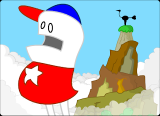
- The art style is so stupid that it’s actually amazing. Apparently it was drawn this way because they were having a bit of fun with the storyboards (which don’t work anymore from the link in the menu, it’s not just you. You can find them here) and they would draw the characters in exaggerated ways. Since it turned out really funny looking, they decided to animate the whole cartoon this way. And I love it.
- I believe this is the first appearance of Coach Z outside of Where My Hat is At, and he has a fairly decent performance here, but it will improve over time.
- This is the first time Marzipan shows up in a speaking role. In the old version of the cartoon, she has no lines at all, because Missy Palmer hadn’t been “discovered” yet. That and a huge added scene at the mountain are the main differences between the two versions.
- I told you that Strong Sad would get better after his 10-second part in A Jumping Jack Contest, and hopefully this toon proves that. This was his first major role in a cartoon, and I think it works fairly well. As with all other characters, he will get a bit more characterization over time, but I have no complaints here.
- The commentary on this cartoon is freaking amazing. I probably know the entire thing by heart, and there’s still parts of it that make me laugh. I think the highlights of it are the parts where they make fun of the animation. “Little known fact – Homestar gained a hundred pounds and shrank two feet for this role.” And let’s not forget that Homestar has no legs in the mountain scene because he’s a sophisticated puppet operated by Strong Sad. And the reason he was replaced was because he has no legs. Genius.
- The deleted scenes are pretty great too. The first one is great if only for Homestar’s little outburst, the second one is just plain disturbing, and the third one is … meh. I believe this was the first time I ever saw Strong Mad, so I was quite confused.
For such an early cartoon, I have to give this one some credit. The original version isn’t exactly amazing, but it was still funnier than any of their previous work by a fair margin. And the enhanced version with the scenes on the mountain is quite good even by current standards. Then of course there’s the commentary, which I’ve already praised, but seriously, more people need to be aware of that. I think it’s so easily overlooked because the older cartoons have a bad reputation. And yes, I’m going to ignore the theatrical trailer, because this sentence right here acknowledging its existence is pretty much all it deserves. For what it is, it’s fine, but nothing to write home about.
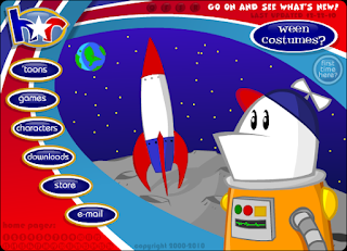
And now, for no particular reason, I shall talk about the original set of Main Page menus. “Original” being defined as the ones that existed when I first discovered the site. Technically, nothing past the 6th one was on the site when it first started, but too bad. Since I doubt I’ll have more than a few sentences to say about most of these, I think going to list format is a reasonable idea. But first, some statements that apply to most or all of these.
Ok, so you know how different things happen when you mouse over the various buttons? Sometimes the effect will stay for as long as you keep the mouse there. And if you click the button and drag away from it, then let go, the effect will remain even when you mess with the other buttons. On some pages, this can create some interesting effects.
Also, just because I guess I should mention it now and I’m not sure when else I’d bring this up, yes, we’ll be looking at the various other pages at some point, including the Museum and older versions of these pages. Some, like Downloads and Email, are going to be incredibly boring, so you have those to look forward to, but alas, I have things to say about them, so you’ll have to bear with me. I don’t have any particular time planned out for doing these, but probably not for a while. Anyway, on with the main page reviews.
All the other Main Pages were added at some point after I had discovered the website, which I realize is an arbitrary and self-centered way to organize these, but nonetheless, I’m going to stick to it. The majority of them are references to other parts of the website that haven’t been seen yet, so they will be mentioned when relevant. Now, there’s one last thing I want to cover before ending this entry. Go back to the King of Town DVD, and play around with the menu there a little bit. Don’t worry, I’ll wait for you.
…
Did you find it yet? Whether you did or not, welcome to the concept of Easter Eggs. I’m sure that most people are aware of this term, since it’s used in many forms of media, but basically, an Easter Egg is anything hidden, whether it be in a game, movie, menu, or whatever. In the case of Flash cartoons, it usually means it’s something you wouldn’t think you could click, but you can. And in the King of Town DVD, you can click the moustache on the shield, then the brick behind it, and you will access something funky.
 Trivia time: this was originally posted on the website on April Fools 2003, and after that, was snuck into the hidden spot in the DVD. I’m not going to cover each aspect of this, because there’s no point really, but it’s an interesting little Easter Egg and worth taking a look at. The Revenge of the King game is accessible from nowhere else on the site, and it makes for a nice distraction for a few minutes. And the Email thing is kinda funny, though I must admit that new viewers who aren’t too familiar with Strong Bad Email won’t get the joke. And yes, much like the Yello Dello storyboards, the “Download” won’t work here. You’re not missing out, don’t worry.
Well, I believe that’s enough for today. Next time, we could look at some of the other old toons from 2000, but instead, I think it’s due time to get better-acquainted with the main cast. We’ve seen all of the original main characters in action, some more than others, so I think that it’s a good idea to check out the Character videos. I’ve got plenty to say about everybody, so it’ll be a nice long one.

Another great post.The first homepage I got was the Dead as a Dornail one, which didn't exactly sell me, though I watched some toons and I liked it.
ReplyDeleteALSO FIRST111
ReplyDeleteI'm glad you're doing this. I've been meaning to go back and watch all the Homestar Runner stuff, but I haven't had the motivation to do so. This is a great outlet.
ReplyDeleteI remember when I started watching the newest toon was "The Homestar Runner Gets Something Stuck in His Craw". This, then watching "Search for the Yellow Dello" and then I'm guessing "A Jorb Well Done" at that point I thought every toon on the site had a different style.
ReplyDeleteOne of my favorite menus is one of the secret ones, though of course you haven't even gotten to him yet.